Hello, I'm [TWDEV] hannibaldinski and this week I will be sharing some design details of the Traction Wars HUD. I’ve been working on Traction Wars since 2010 but you haven’t seen a lot from me although I like to call myself the interaction designer of the team. For those of you who don’t know what that is, it’s about designing experiences, how the game communicates with you and ensuring you are completely immersed in the game.
Please be aware of the following contains work in progress content. Features may be subject to change before release.
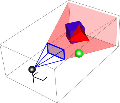
Games work in a certain way so you can’t always compare them to real life. They should be treated as two different things and you can’t just copy what’s out there in real life. For example, your field of view in the real world is roughly 180° and you can’t see sharply at the edges though you can recognize movements. This peripheral vision is very handy if there is any danger, like an approaching bear or tiger. In games you lack peripheral vision and your field of view is only +/- 60°. This means you have a hard time getting all the information you need because you have less spatial awareness with the result that the player needs some form of help. This is mostly done in game by graphical elements placed on your screen, which is known as the HUD or Head-Up Display.
Now it gets more complicated. Traction Wars is focussing heavily on realism. In the real world you don’t have a HUD telling you stuff so we’re looking for the right balance between the real and virtual world. HUD will have a big impact on immersion (i.s. how involved you are) and gameplay.
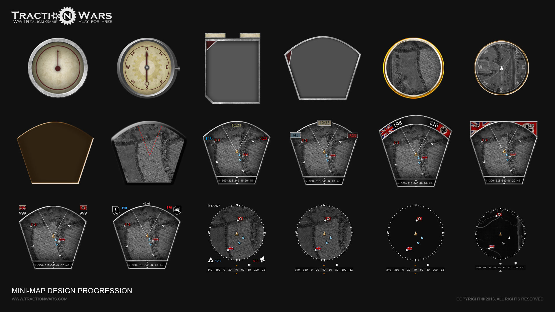
Three years of mini-map design iterations
Since I joined Traction Wars three years ago there have been many forms of our HUD. It’s impossible to get it right the first time. To find the right balance we have been testing and researching a lot of ideas, from showing a lot of information to almost nothing. We are trying to show as little information as possible but as much as is needed. The more we can implement in the game itself with animations and visual feedback, the closer we can get to the real world.
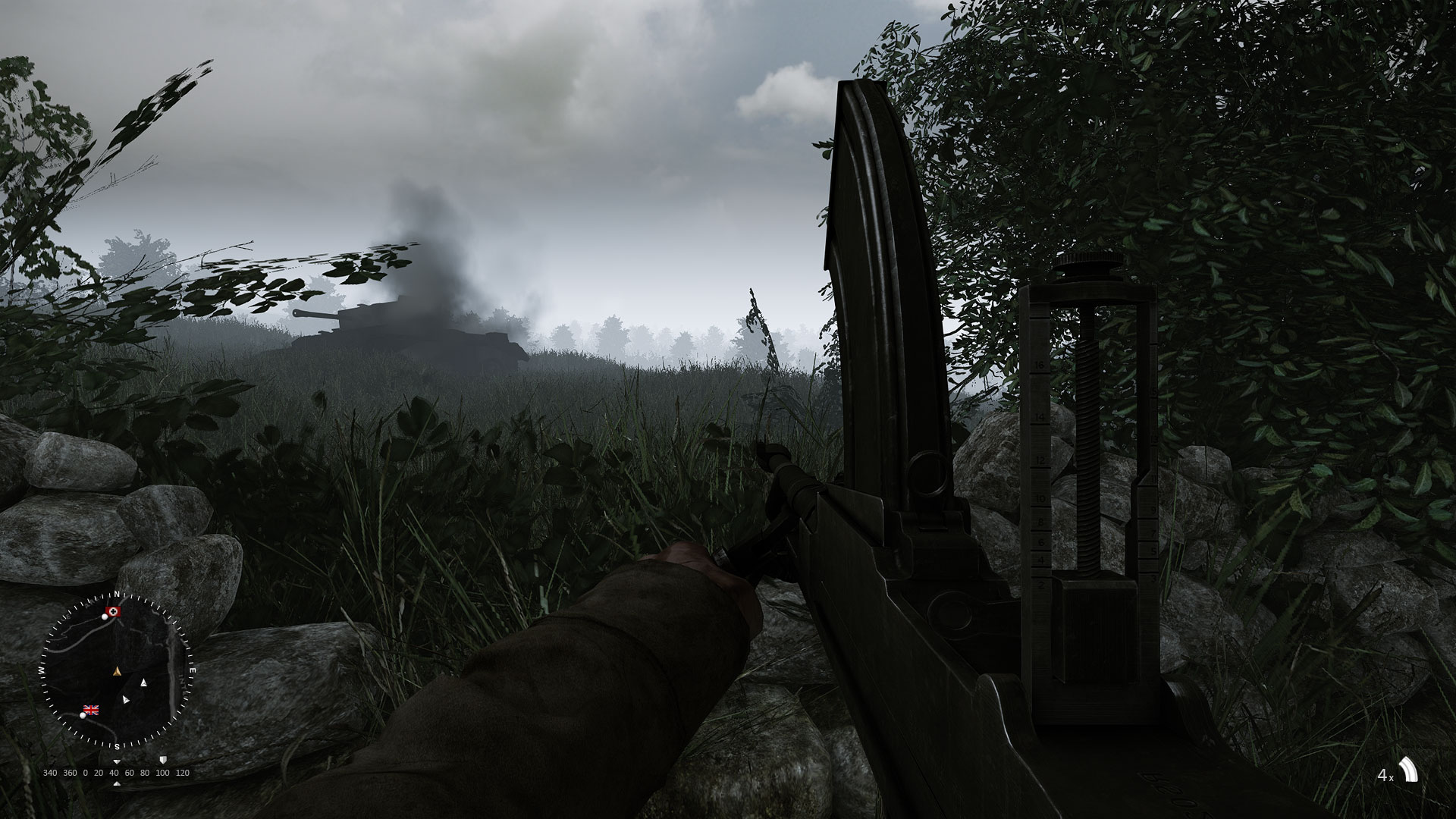
Current HUD design
So let me explain what you see here. It’s our current version of the HUD, which during play is not visible. When you press a certain key the HUD appears and when released it disappears again. HUD only shows a mini-map and compass, which are there to give you a better spatial awareness. They show your position relative to friendly players and important features of the map. Team-mates will only be shown when directly in view without any obstacles between you and them. These icons will slowly fade away when losing contact although things like objectives and orders will always be visible. To orientate properly you’ll have to pull out a physical map, so you can’t use your weapon at that moment -just as in real life. Depending on your class you’ll have a more or less detailed map.
Telling team-mates where to look at can be difficult. If someone says “Look left”, you’ll probably not look to the correct “left”. That’s why we incorporated a compass, making it easier for your team-mates to look in the right direction and not get themselves killed.
As you may notice the mini-map and compass are placed on the bottom left. This corner of the screen is mostly blocked by the player's arm, so it is a perfect area for something like the mini-map. The rest of your view isn’t blocked so it is optimal for checking your surroundings.
On the right we have the magazine counter. This shows the total amount of magazines, grenades or belts the player has left. The amount of bullets left will not be shown as players can keep count for themselves - again as in real life.
There have been almost three years of HUD iterations and it is still work in progress so it may see changes before release. I would love to hear some feedback from you. Feel free to criticize but please try to explain your criticism. This makes it more useful.
There is much more to talk about. Stuff like squad-command order system, the soldier immersion system, suppression, health, hit orientation, moral systems, fancy menu’s with shiny buttons and more. So keep an eye open for more dev blogs and thanks for reading.
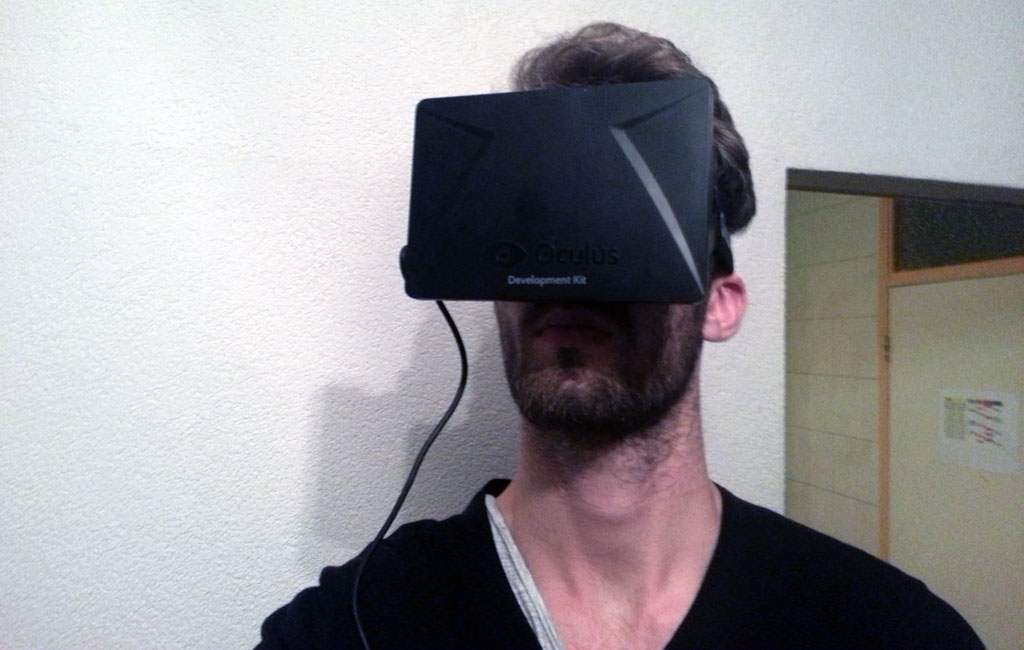
One more thing... we got our hands on one of these.
Looks like some kind of virtual reality thingy?
Interested in joining the team?
The team is currently looking for level designers and particle artists who have experience in CRYENGINE. If you have the experience and are interested in being part of our friendly and professional team then please head over to our recruitment page for further details.
For the very latest media and updates follow us on the social networks below, as well as our community forum and our media gallery.
Please be aware of the following contains work in progress content. Features may be subject to change before release.
Games work in a certain way so you can’t always compare them to real life. They should be treated as two different things and you can’t just copy what’s out there in real life. For example, your field of view in the real world is roughly 180° and you can’t see sharply at the edges though you can recognize movements. This peripheral vision is very handy if there is any danger, like an approaching bear or tiger. In games you lack peripheral vision and your field of view is only +/- 60°. This means you have a hard time getting all the information you need because you have less spatial awareness with the result that the player needs some form of help. This is mostly done in game by graphical elements placed on your screen, which is known as the HUD or Head-Up Display.
Now it gets more complicated. Traction Wars is focussing heavily on realism. In the real world you don’t have a HUD telling you stuff so we’re looking for the right balance between the real and virtual world. HUD will have a big impact on immersion (i.s. how involved you are) and gameplay.

Three years of mini-map design iterations
Since I joined Traction Wars three years ago there have been many forms of our HUD. It’s impossible to get it right the first time. To find the right balance we have been testing and researching a lot of ideas, from showing a lot of information to almost nothing. We are trying to show as little information as possible but as much as is needed. The more we can implement in the game itself with animations and visual feedback, the closer we can get to the real world.

Current HUD design
So let me explain what you see here. It’s our current version of the HUD, which during play is not visible. When you press a certain key the HUD appears and when released it disappears again. HUD only shows a mini-map and compass, which are there to give you a better spatial awareness. They show your position relative to friendly players and important features of the map. Team-mates will only be shown when directly in view without any obstacles between you and them. These icons will slowly fade away when losing contact although things like objectives and orders will always be visible. To orientate properly you’ll have to pull out a physical map, so you can’t use your weapon at that moment -just as in real life. Depending on your class you’ll have a more or less detailed map.
Telling team-mates where to look at can be difficult. If someone says “Look left”, you’ll probably not look to the correct “left”. That’s why we incorporated a compass, making it easier for your team-mates to look in the right direction and not get themselves killed.
As you may notice the mini-map and compass are placed on the bottom left. This corner of the screen is mostly blocked by the player's arm, so it is a perfect area for something like the mini-map. The rest of your view isn’t blocked so it is optimal for checking your surroundings.
On the right we have the magazine counter. This shows the total amount of magazines, grenades or belts the player has left. The amount of bullets left will not be shown as players can keep count for themselves - again as in real life.
There have been almost three years of HUD iterations and it is still work in progress so it may see changes before release. I would love to hear some feedback from you. Feel free to criticize but please try to explain your criticism. This makes it more useful.
There is much more to talk about. Stuff like squad-command order system, the soldier immersion system, suppression, health, hit orientation, moral systems, fancy menu’s with shiny buttons and more. So keep an eye open for more dev blogs and thanks for reading.

One more thing... we got our hands on one of these.
Looks like some kind of virtual reality thingy?
Interested in joining the team?
The team is currently looking for level designers and particle artists who have experience in CRYENGINE. If you have the experience and are interested in being part of our friendly and professional team then please head over to our recruitment page for further details.
For the very latest media and updates follow us on the social networks below, as well as our community forum and our media gallery.
Last edited:
